


In recent Making Minutes Matter posts, we started exploring 12 principles to help us design effective multimedia learning resources. First, we looked at Navigating Cognitive Overload. Next, we explored how to keep our materials simple with Mayer’s Coherence and Signaling Principles. Let’s explore another helpful principle.
How much is too much?
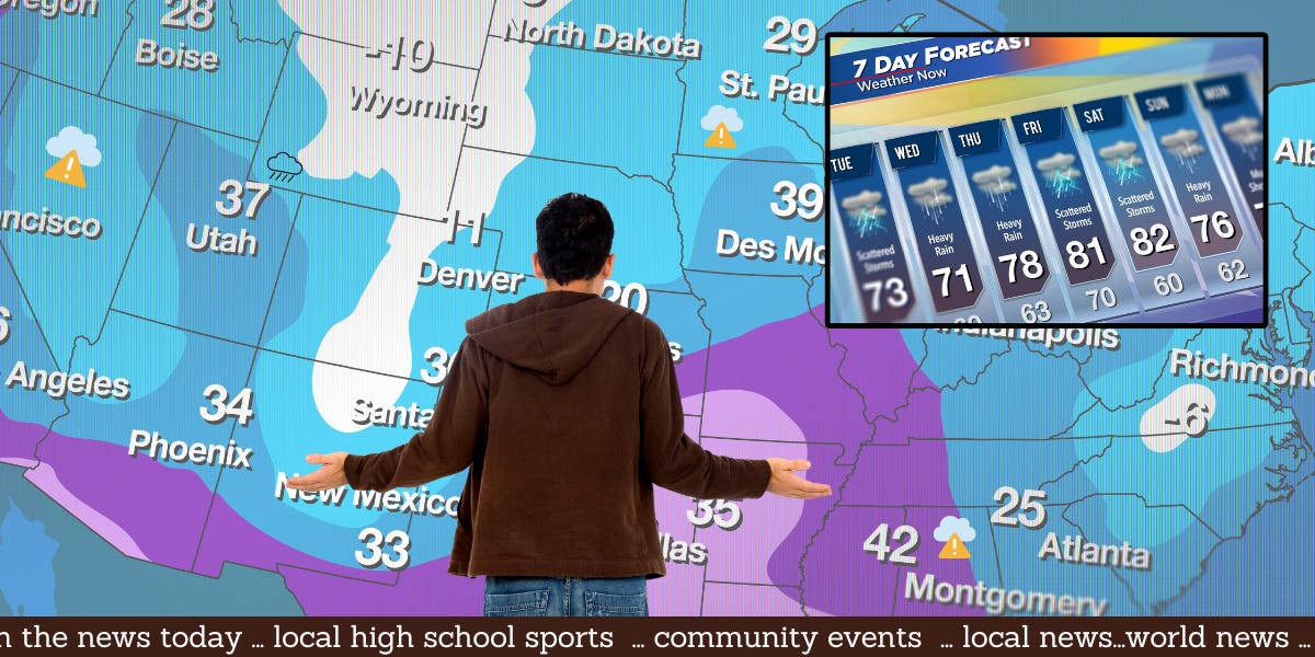
Did you ever see a video or presentation that was more confusing than clarifying? Often, presenters talk while showing a graphic and displaying text. Although well-intentioned, this can be confusing or overwhelming all at once. For me, weather forecasts on the news are confusing because of the redundancy. The weather person is talking through the forecast; the map is using colors, symbols, and text to convey information. There may be a legend showing what the colors mean and a scrolling news bar along the bottom. All of this happening at once makes it hard for me to decide where to look or if I should just listen; it’s all just too much.
Introducing the Redundancy Principle
The theory behind the Redundancy Principle is that people learn best with narration and graphics (rather than narration, graphics, and text). Remember that we have two channels for processing (auditory and visual). If designed well, graphics visually illustrate a concept or process, and the narration provides auditory context. Adding text the learner must read is redundant. This can be a problem because learners will switch back and forth between the written text and the graphic, which is not optimal for understanding the information.
The following video explains how to avoid this and gives tricks on using the Redundancy Principle in your own work.
As you create your own multimedia materials, consider how this principle applies to your work, and remember - keep it simple!
This makes a lot of sense. There's often too much of everything that can confuse the learner. Your weather illustration is a good example of this principle.